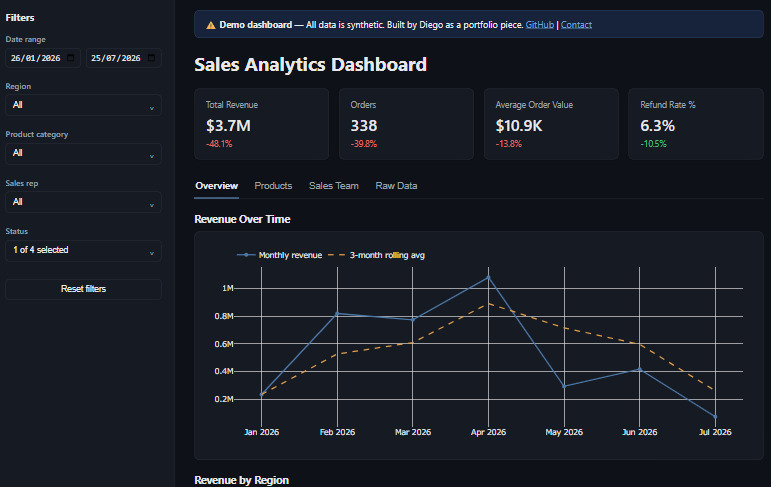
Sales Analytics Dashboard
An interactive BI dashboard built with Streamlit and Plotly. Features multi-dimension filtering, real-time KPIs, and drill-down analytics. Data is synthetic.
I build Streamlit dashboards, Python automation tools, and interactive data experiences for small businesses.

I'm Diego, a developer based in Paraguay focused on turning messy data into tools people actually use. My work sits at the intersection of Python, data visualization, and internal business tools — the kind of software that saves teams hours every week.
I've built BI dashboards for a mortgage lending company, automated Excel-to-report pipelines, and integrated CRM systems for internal workflows. I work best with small teams that need a technical partner, not a code monkey.
An interactive BI dashboard built with Streamlit and Plotly. Features multi-dimension filtering, real-time KPIs, and drill-down analytics. Data is synthetic.


Python tool that reads unstructured Excel files, cleans data, and outputs formatted PDF/Excel reports. Reduced manual reporting from 4 hours to 2 minutes for a real client use case.
More project write-ups coming as I ship them.